The one Where They Choose
Brothers Grimm Rapunzel
Examples of others work
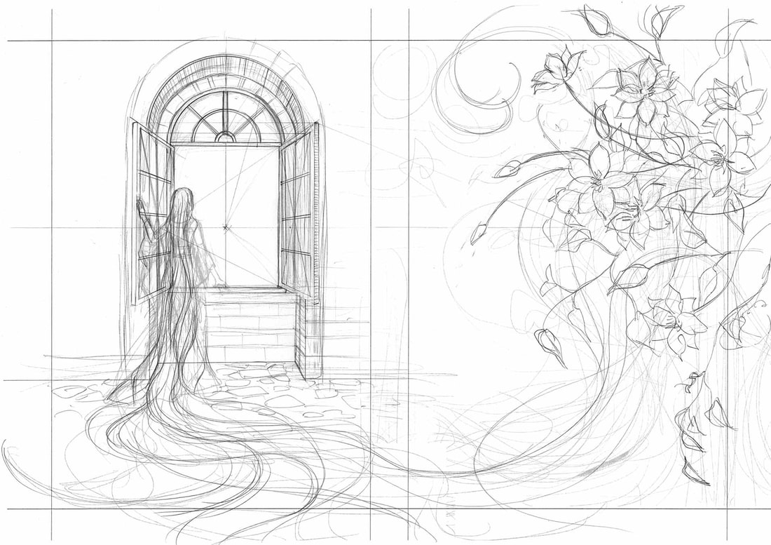
Thumbnailing original Ideas

I have decided that the best way for me to do this project is to use the media that I am most comfortable with. This means that I will be doing these book illustrations in watercolour.
Another decision I have made is that I am going to be using my niece Taylor as my reference for little Rapunzel. This will also make her happy since Rapunzel is her favourite princess.
Another decision I have made is that I am going to be using my niece Taylor as my reference for little Rapunzel. This will also make her happy since Rapunzel is her favourite princess.
Experimenting with my Thumbnails
1st step of page
I wanted to tackle painting Rapunzels tower since out of everything I think that this is what I would struggle with the most. I then went into photoshop and edited the image a bit to get rid of some of the pencil marks and the small mistakes i have made.
Finalising the page
I decided to scan in the image and see if I would be able to add another aspect of colour and make it look more children book style.
Change of plan!!
Since having a formative feedback session it was decided that the work that i had produced would not be the best for me to move forward with since the colours I had chosen are so bright and saturated it did not fit the story as much as i hoped it would have. This combined with the lack of references used it left to my drawing just not being as strong as they should have been.
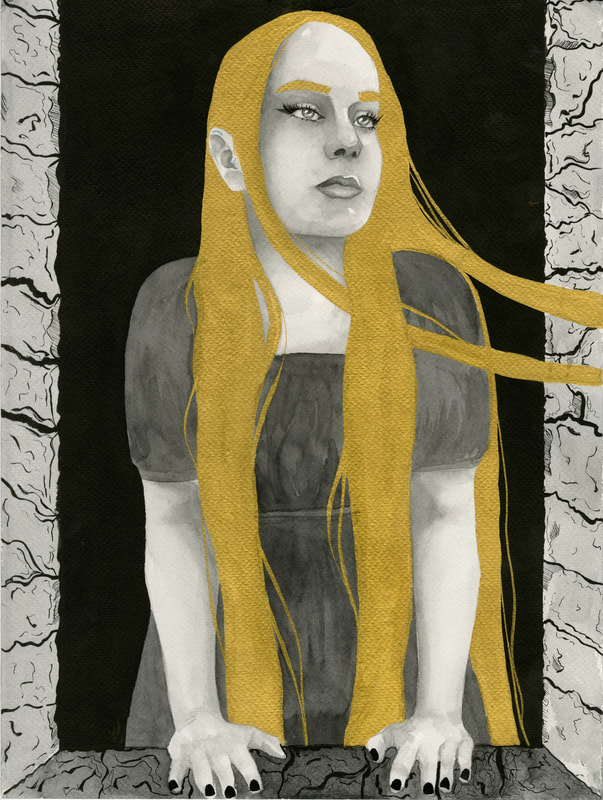
When receiving this feedback I was told that I should take a darker approach than I have. This has lead to my creating mostly black and white work with block colour and areas of gold. Doing this has made my work look a lot more gloomy which is what I wanted. This has also helped my with understanding the text I chose a lot more since I was able to make a lot of the focus on Rapunzels golden hair.
When receiving this feedback I was told that I should take a darker approach than I have. This has lead to my creating mostly black and white work with block colour and areas of gold. Doing this has made my work look a lot more gloomy which is what I wanted. This has also helped my with understanding the text I chose a lot more since I was able to make a lot of the focus on Rapunzels golden hair.
Artist Research- Daniel Egneus
After starting doing these paintings with the new theme in mind we had another feedback session and during this we had a discussion about artists i could take inspiration from and the artist Daniel Egneus was brought up and I decided that I would look more into his work as i knew that I had seen his work before.
Daniel Egneus is a self taught artist who uses a mixture of watercolour, ink and sometimes crayons. The style that he uses if very much the sort of look I am going for in this project. The aspect of his work I would like to take inspo from is his use of block colour and also his use of contrast.
Daniel Egneus is a self taught artist who uses a mixture of watercolour, ink and sometimes crayons. The style that he uses if very much the sort of look I am going for in this project. The aspect of his work I would like to take inspo from is his use of block colour and also his use of contrast.
1st Mock Ups
After Feedback
I found a better gold that allows me to be able to make a flat gold colour. This also makes it possible for me to be able to re-do the painting which ended up a lot better for me since was able to get the contrast to where I wanted it.
Site powered by Weebly. Managed by 34SP.com


