Illustrators Toolkit
Week One
Pen and Ink
Artist Inspo
Ian Miller
One of the main reasons I have been drawn to his work is his use of local tone. All of his work is very dark and full of texture so that even if you do not quite know what he has drawn you find it kinda scary.
The main aspects of his work that I would like to experiment with using is to not put myself in a box whilst I am drawing and inking, I want to apply different types of shading throughout a piece and it still be cohesive from one side to the other.
The main aspects of his work that I would like to experiment with using is to not put myself in a box whilst I am drawing and inking, I want to apply different types of shading throughout a piece and it still be cohesive from one side to the other.

|
Jessica Lauser

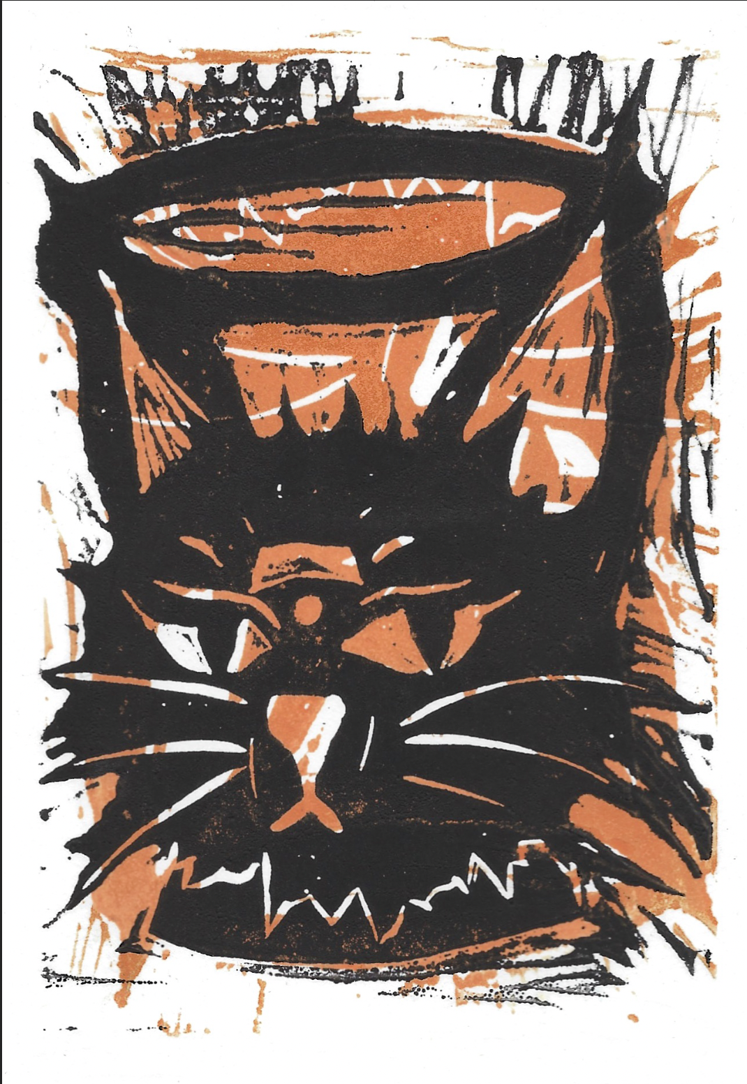
Jessica Lauser is an artist that I discovered on Tik Tok whilst I was looking for inspiration for this project. The main thing that stood out to me about her work is the fact that she uses the inks in a way that reminds me of designs of tattoos. The ratio of black out to detail work is also amazing and inspired me to do a piece inspired by her work.
Dip Pen


|

I found the dip pen quite unpredictable I am defiantly going to have to carry on practicing with. This because I do not have the hang of it yet.
|
Fountain Pen

Room Drawing

Pen and Ink Outcome
The main thing that I gained from this week is that I think that ink drawing is very important and is something that I will carry on experimenting with throughout this journey. They way that I found most effective for me was to loa up a lot of ink into a brush and draw with . Doing this made me a lot more fluid, this also made it so when I did a piece with both dip pen and brush it balanced each other out a lot.

Week Two
3D
Artist Inspo
Alan FletcherThe main thing that has drawn me to Alans work is the fact that he does not restrict himself in any way. this allows for him to have such colourful and inspiring pieces which almost look childlike.
|

|

|

|
I really enjoyed experimenting with shapes with the cardboard. I don't know what it was about it but it made me exited to make it look kinda silly. I love the fact that it does not matter that it does not look exactly like a cat. Like have you ever seen a cat with a square head? I sure haven't.
Also... the cats small turtle friend is adorable.
Also... the cats small turtle friend is adorable.
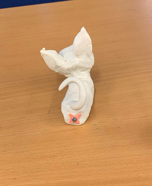
I also had an amazing time working with play dough since I got to experiment thoroughly with no worries off it drying out on me.
And.. it has a butthole :)
And.. it has a butthole :)

Masks
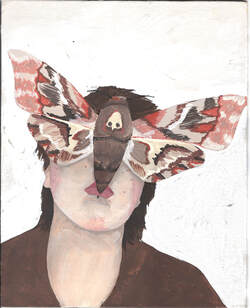
My idea for my mask was to create a mask that represents me a lot. This being a a set of two moths, there are two reasons for this. One being the fact that I have two moth tattoos and the other reason being that I identify with the moth a lot. the reason for this being that I feel like I am the less pretty butterfly and it takes a lot of energy for me to look pretty.

|

|

Week Three
Painting
Artist Inspo
Peter BlakeThe reason I have been drawn to Peter Blakes work is the fact that wis watercolours have areas where it is not fully detailed. This makes you more drawn to the bits that are.
|

|
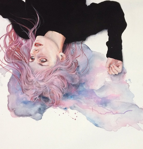
Agnes Cecile
Watercolour portrait artist who also does experiments with Acrylic and pen and ink. The main reason I am drawn to her work is that I have watched her process videos on YouTube and instagram. These give me a lot of information that helps me learn different techniques on how to use watercolour to its fullest potential.
Watercolour portrait artist who also does experiments with Acrylic and pen and ink. The main reason I am drawn to her work is that I have watched her process videos on YouTube and instagram. These give me a lot of information that helps me learn different techniques on how to use watercolour to its fullest potential.

For this piece I did a background wash of a warm toned orange to make the painting stand out more off the page.
One of the scariest things for me is the fact when you start something you always start off with a blank page. Getting rid of that made this much less of a stressful situation for me that I think that it is going to be my first steps with all of my acrylic and gouache paintings.
One of the scariest things for me is the fact when you start something you always start off with a blank page. Getting rid of that made this much less of a stressful situation for me that I think that it is going to be my first steps with all of my acrylic and gouache paintings.


2nd Project
Weeks 1 and 2
Posters
Initial Ideas


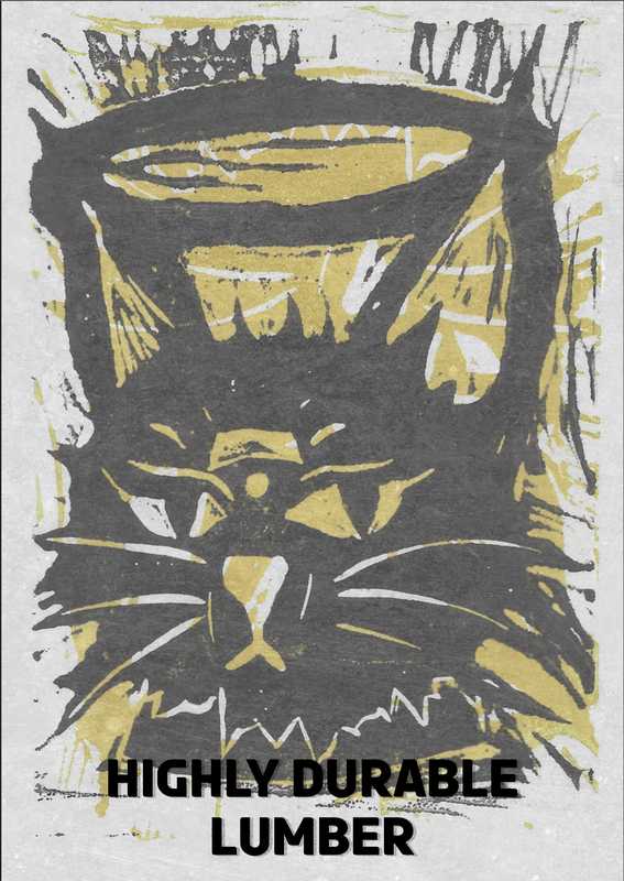
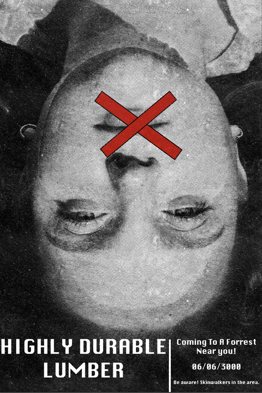
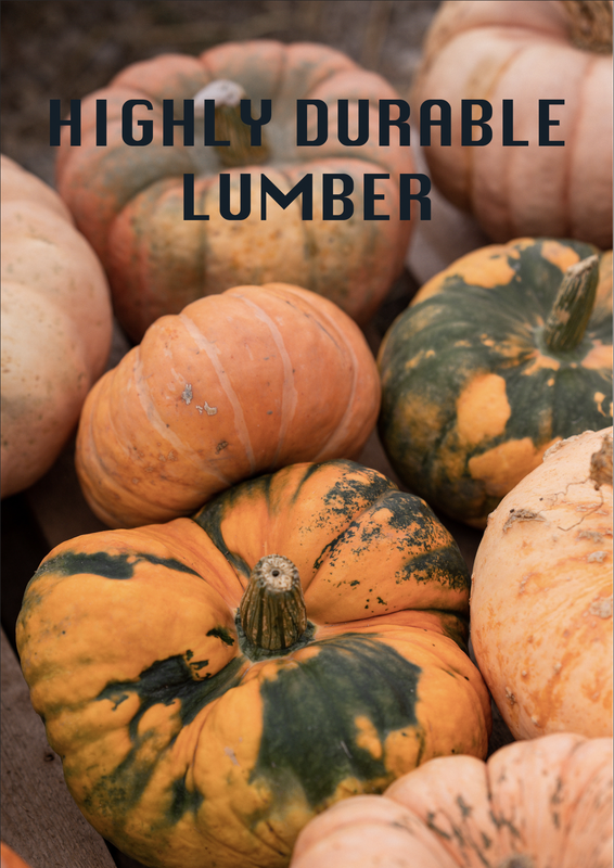
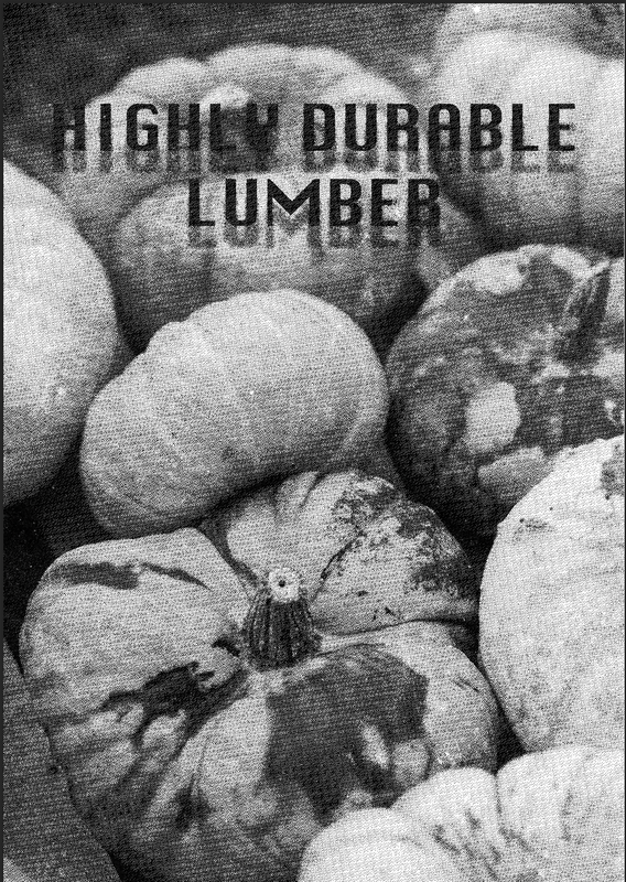
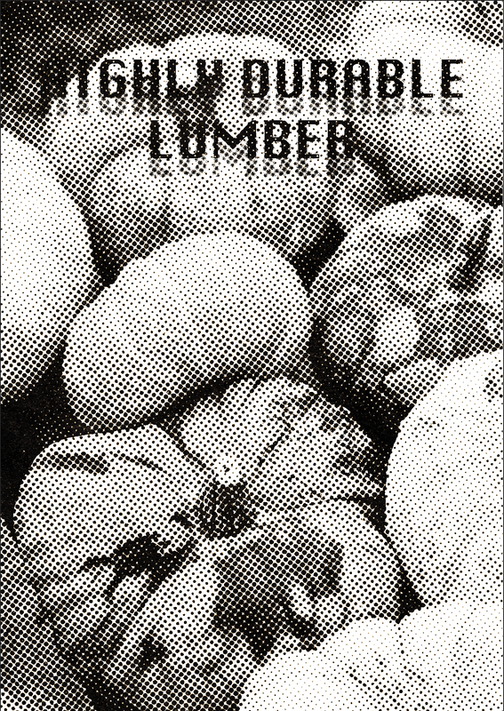
The first thing I wanted to do was to experiment with a piece I had already made and mess about with the colours to see which would be more striking to the viewer.


The colour I ended up going with the black and yellow one since I think it stands out the most to me.

|
|


Illustrator
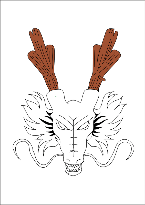
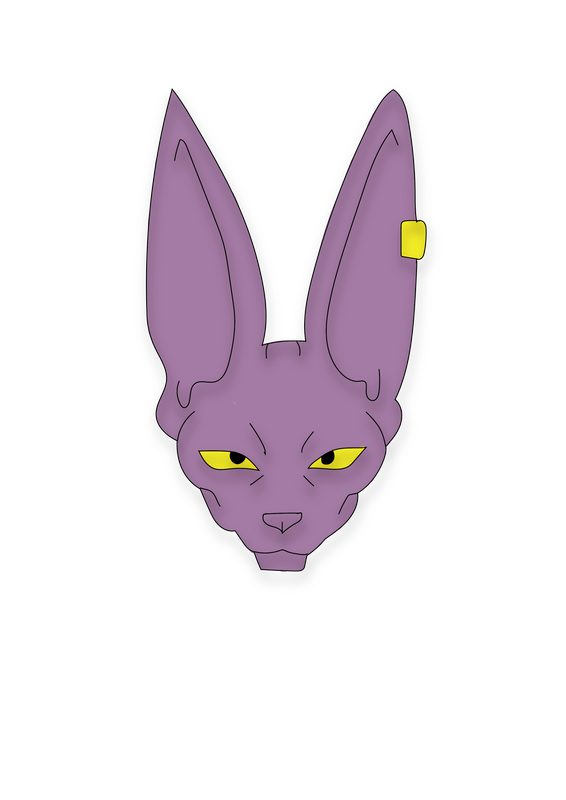
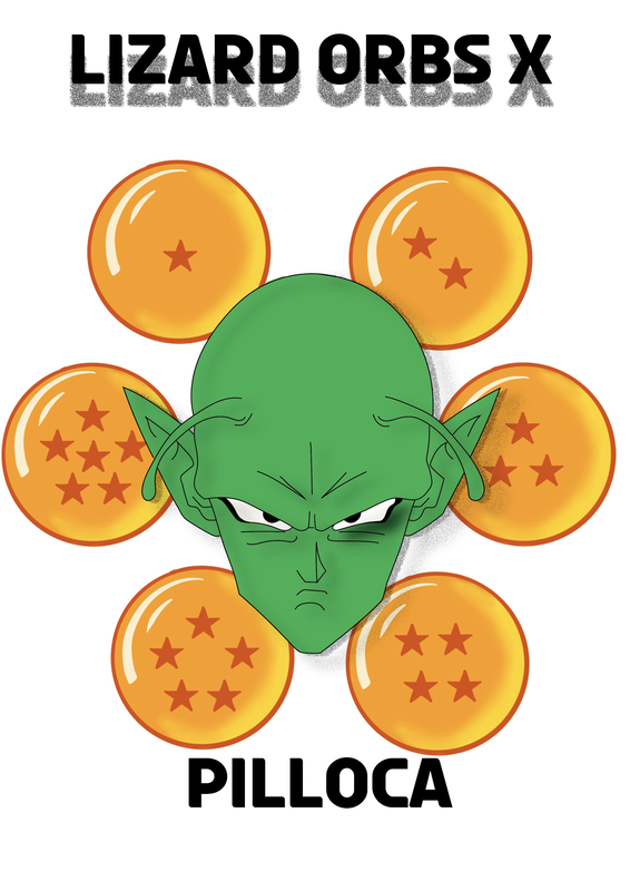
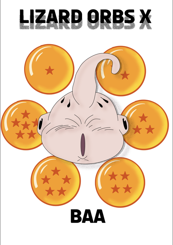
Enamel Pins
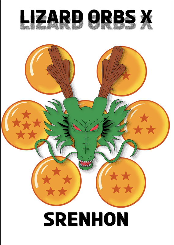
Dragon Ball z


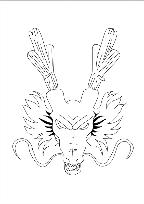


Concepts
Interesting Composition
In the first week of this project the projects was to take the names we have been given and make illustrations of them based on the scenarios that are happening within the scene.
To Practice with this we were given a small task to do in the studio where we were given a random word and we had to draw thumbnails based of them making sure we use interesting compositions that create movement and are not always straight on which is something a lot of us default to on instinct.
The word I got was FREEFALL
Mt initial ones were all very basic and did not give the affect I wanted them to have. Each of them really had the same view point and were not very interesting.

On this next page I started to think about more interesting viewpoints this instantly started my make my work have a lot more character and look a lot more interesting on the page. It was at this point that I started to be able to see that some of the designs I had made had potential. This lead to me adding colour which gave the designs even more life and helped me decide which would be the ones that I would end up handing in.

|

|
Work For Brief
Week 1


Week 2


Week 3-4
The Mind and Dying of Mr Punch


